Hello!
I’m Lauren, False Title’s Marketing Manager. I thought I would write a little post about how we came to decide on the final image for our show, WOMENSwear, the concepts we rejected and the ideas behind the final design.
One of our first ideas was the image of a burning bra on a washing line- we got inspiration from pictures we found on the web, and we thought that such a striking symbol of feminism would be perfect for our flyers and posters. As WOMENSwear explores conflicting cultural attitudes to women, within a framework of the history of womenswear and womanhood, we wanted an image that would convey strength, femininity and revolution- something that would look striking in a programme or poster, and provoke our female audience to think about their experiences as women.
We stuck with this idea for quite a while, but ultimately decided that we could be a little cleverer and more creative with the design. Although the burning bra image is immediately associated with feminism, we wanted people to view our show as more than just an attack on the world and the way it treats women- we found that people saw the image as more negative than positive, a symbol of extreme feminism.
Moving on from the bra on the washing line, going up in flames, we started thinking about Adam and Eve and the apple, looking more closely at the seductress side of womanhood, temptation and being forbidden. We toyed with the idea of an apple bitten into with red lipstick marks on it, a man holding a bitten into apple with lipstick marks on it and various other mutations of the original idea, but we decided that it was too removed from the concept of the show and would be too misleading.
After all that, we eventually arrived at an idea that actually stuck! Going back to the very basic notion of the show, a play exploring women’s lives within very different cultures around the world, we decided to come back to the westernised narratives and use them to create an image relevant to our concept as a whole. We came up with the idea of ‘WOMENSwear’ being written onto a woman’s body like a tattoo, symbolising the individual characteristics we all have embedded in us as women, but also symbolising a branding, the stereotypes we have thrust upon us. We wanted something that would portray strength and femininity, transcending those ideas into both the eastern and western cultures we want to represent in the show.
With all that in mind, we took several photos of our model in her bra and knickers, with her back to the camera, firstly with her bra fully on and on a pink backdrop:

Then with her arm up, an idea we got from the ‘we can do it’ WW2 poster (see here: http://upload.wikimedia.org/wikipedia/commons/1/12/We_Can_Do_It!.jpg):

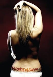
And then we tried with one strap of the bra off, to show her back and create a cleaner image:

We loved this look, with the label hanging down and her arm clutching her hair, so we ran with it and decided to do the same shot but against a white background:

This was a huge progression from the first few images we took, so I then experimented with the colour of the image:

I loved the pink hue of this edit, and how the arm slowly fades away in definition. We wanted a photo that would capture the essence of WOMENSwear, something that coupled with our copy, would grab attention and get people talking about women and their role in society. I think all of these things translated into the final image, created by Andy Farenden in conjunction with us, which is this:
We all absolutely love this picture, the darker background suggests a slightly darker undertone to the show, and I think this will translate well to the programme, posters and flyers.
Let us know what you think!
Lauren.